Details. Details. Details. Disneyland is all about the details. One might think when starting a project from scratch that uniformity is key to telling a narrative story. When I cut a video, I need to make sure that all the graphics flow, fonts match, sizes match and are aesthetically pleasing. The key to my work is not to be noticed. Disney took this to the next level when creating a park with many different lands, messages, and simultaneous stories.
Today, I’d like to point out the amazing signage at the park. In just under 20 minutes, I captured so many different signs in the park. From Tomorrowland restrooms to New Orleans Square, one is bombarded by messages pointing in one direction or another. These signs are so perfectly themed that one might not even notice them.
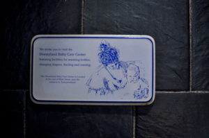
I don’t know what it is but these 19th century signs just make my day. Super simple and unique yet effective. It really matches the theme of the First Aid and Lost and Found offices over on Main Street USA which is also modeled after a late 19th century town. This sign was found in Tomorrowland but draws the connection to this particular storyline.
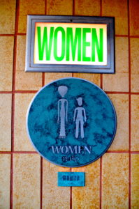
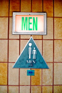
These restrooms look almost untouched since 1955. They’re tucked away between Innoventions, Autopia, and the Tomorrowland train station. Starting with the signage up top, I think it’s the yellowing of the plastic sign, the font size and shape as well as font color that give it away. In addition to its tucked-away nature, I like to think that this building looks just as it did when the park first opened (even though its adjacent attraction, Carousel of Progress, didn’t open until 1967.)
The lower sign suggests a future when alien and human life might live together. I particularly love the Women’s signage as the taller alien woman looks to be wearing a dress but upon further inspection, she’s got some kind of tentacle/scale motif going on. Nice touch. Even the alien language here continues the theme in a more cerebral way. By far one of my favorite park details.
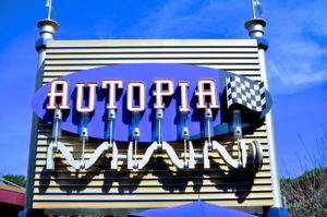
Check out this Autopia sign in Tomorrowland. Complete with pistons supporting the letters and a checkered flag, one could see this sign without knowing there was a ride and “get it.” Ingenious.
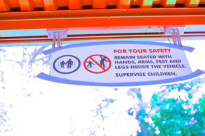
There are plenty uses of this sign around the park. The first time I noticed it was on Haunted Mansion and it was pointed out by a buddy of mine. Since then, I have noticed it in every park I have been to. While it’s standard safely protocol and less about the imagineers trying to tell a story, storytelling seems to be inherent in the guests now as we make our own stories for standard signage. We like to think that one must remain seated and not dance on the rides. Seems to stand true, in a sense.
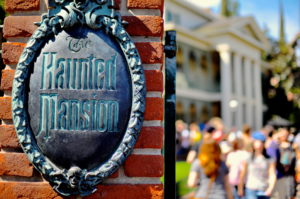
From the font to the color scheme, the imagineers nailed it with this attraction. The wait-time board matches the attraction signage which matches the look and feel of the attraction. And, while I could have desaturated the colors in this photo and made it look more cold and “scary,” I chose to really keep it true to how it appears in person because even then, the sign itself “betrays an aura of foreboding…” The imagineers hit a home-run with this attraction’s signage and trend-setting font.
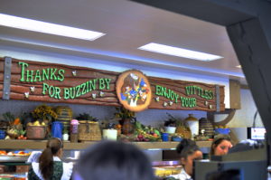
Finally, we take a look at a reference to an old attraction. The Country Bear Jamboree, while gone from Critter Country at Disneyland, is alive in plenty of references throughout the current Critter Country. Even the Winnie the Pooh attraction has some of the old animatronics from the old show. But in this sign from the Hungry Bear restaurant, we see our cast of misfit critters thanking us for visiting. Not sure if the kids will get it but it still fits within the theme of the land and parents will get a smile remembering the attraction that used to be. Luckily, the parents can still take a trip to Walt Disney World and show their kids a version of the show that still operates daily in Frontierland.
While we only touch on some of the great signage, take a look around next time you’re at the parks. There are details all around you that you may take for granted — and that’s their job!
